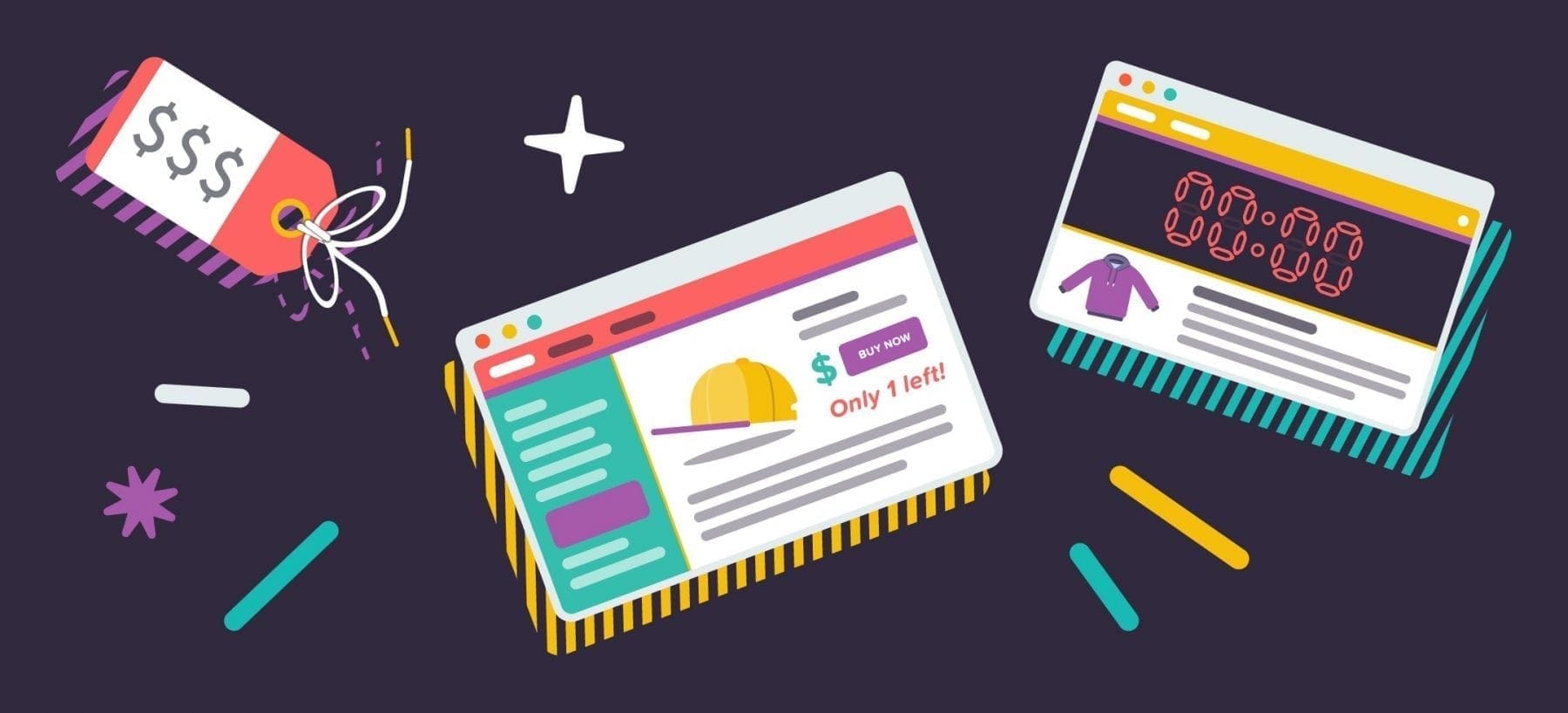
Have you ever felt an urged to make a purchase because “today is the last day for free shipping”? What about feeling hurried to check out because your wish-list item is low in stock, and you just can’t risk losing this chance? If you are familiar with the world of sales, you’ll know that these are intentional and successful tactics to encourage conversion, known as urgency and scarcity methods.
These tactics can prevent your customers from talking themselves out of a purchase or potentially abandoning their shopping carts. Marcus Taylor from Venture Harbor reported a 332% increase in sales after he implemented a sense of urgency in his store. So, what are some of the ways you can replicate this success in your own e-commerce business?
Set a deadline
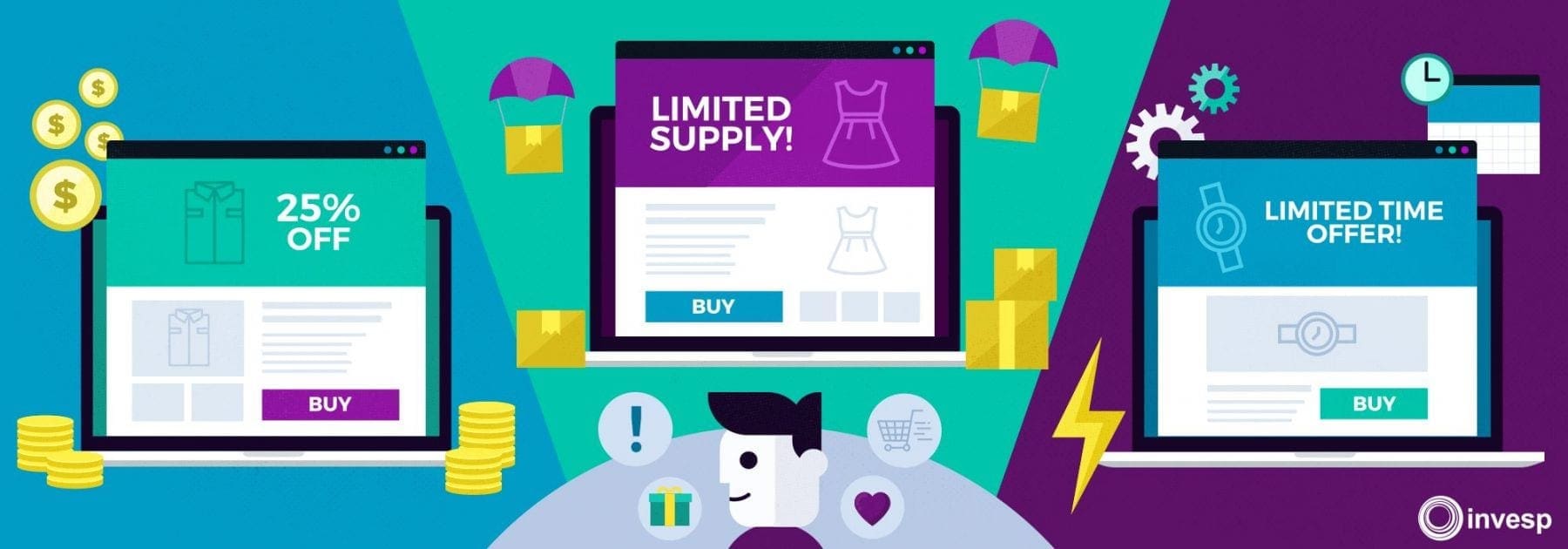
The easiest way to create urgency is by setting a deadline, whether it’s a limited time discount code, a countdown timer for free shipping, or a free gift that can only be unlocked before a certain time. This tactic works because it creates just enough urgency for customers to act, leaving them less time to reconsider their decision.
Your shop can replicate this tactic by implementing a countdown timer, or highlighting words such as “Limited-time only!”, “Quick!” or “This weekend only!”, etc. Be careful, though, too many of these visual cues or urgent verbiage can potentially turn your customers off.
When you do set a deadline for an offer, though, remember to blast it everywhere: On your homepage, on the checkout page, on your social media, as well as taking advantage of newsletters! Then, sit back and watch customers rush over to your store.
Create FOMO: Fear of Missing Out
People sometimes do certain things out of fear, rather than necessity. More specifically, fear of missing out (FOMO). Your online store can replicate this sensation by offering something “exclusive”, so that customers can’t help but feel like they could miss out on something if they didn’t act now.
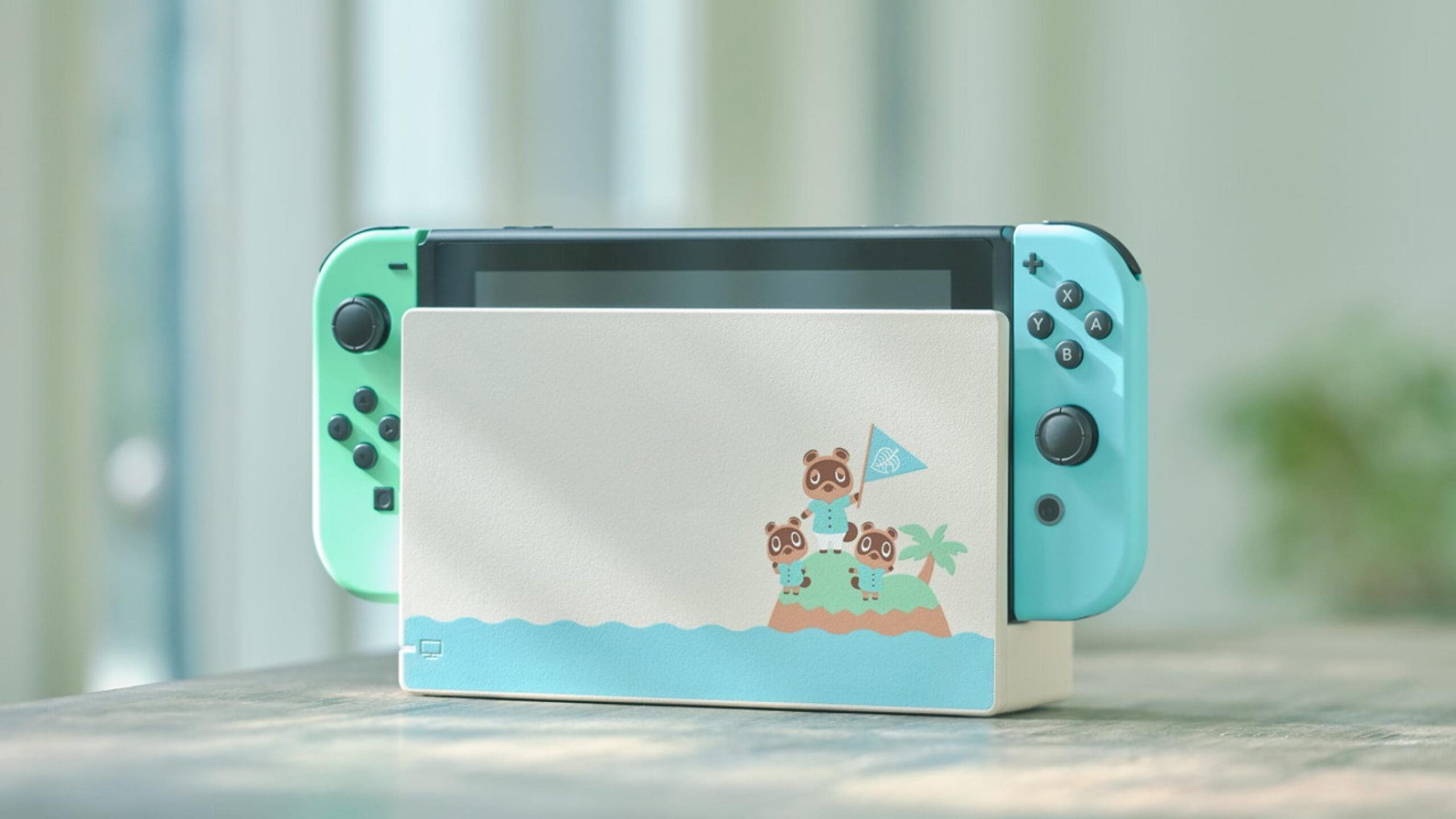
Brands with a loyal customer base usually offer limited-time special editions, like Nintendo with the Pokemon Switch, or recently, the Animal Crossing Switch that sold out almost instantly. Similarly, customers also go crazy for new launches every time their favorite celebrity or influencer partners with a brand. But wait – not only famous people can evoke this sense of exclusivity. Remember earlier this year when Croc partnered with KFC for a special edition design? We do.
There are many other ways your store can create FOMO without necessarily creating a whole new product. Many sites, like Sephora for example, offer limited-time bundles or value sets. Your store can also offer signups for exclusive perks like birthday gifts, free shipping, or other incentives only available to members.
Use pop-in to capture attention
Pop-ins can appear anywhere on a website – usually on the homepage or checkout page, asking customers for their email addresses and social media handles in exchange for unique discount codes or other incentives. Pop-ins work for a few reasons: First, it offers customers something they want for something relatively easy to give away (discount code in exchange for their email). Second, it takes over the screen and captures their attention.
Not only can pop-ins encourage sales, it also builds your database of customers and visitors. Even if the visitor doesn’t make a purchase, you now have their email address in order to start building a relationship down the road. The Upfluence Live Capture tool works on this principle by capturing your visitors’ information and helping you to identify future ambassadors.
However, like most other methods, pop-ins also require some level of deliberation. Make sure that your pop-in doesn’t show up too frequently or too soon and risk annoying your visitors. Why not combine this pop-in with a deadline to further encourage urgency!?

Display stock quantity
Similar to the fear of missing out, there is also the fear of Out-of-stock or Low-stock items. By displaying the number of stock left for an item, or simply a badge showing “Low stock”, you can encourage customers to act quickly. You can also subtly implement this strategy by adding badges such as “Hot item”, “Highly popular item”, or “Most loved item” on your product pages.
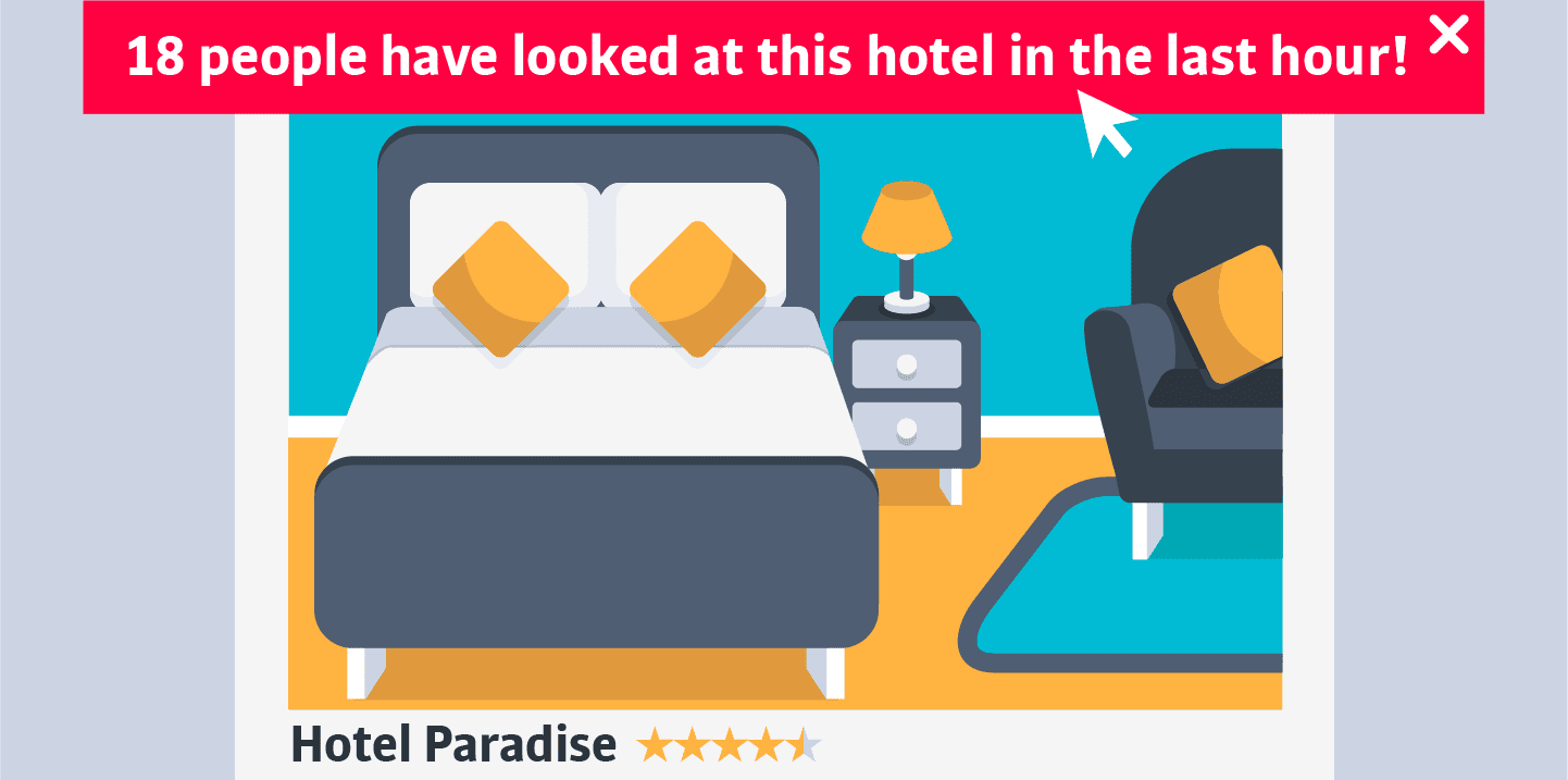
Many brands also send follow up emails to remind customers that they have a low-stock item in their cart. This is a smart way to say “you need to buy this now!”. Some brands also send newsletters announcing that their frequently out-of-stock products are finally back in stock – it really does work both ways! This tactic also combines the sense of FOMO by implementing a deadline for this highly sought-after product. Some stores even display the number of other customers who also have viewed the same item, in order to suggest that it’s a hot product with a chance of being out of stock soon.
Use powerful copywriting
A smart way to evoke a sense of urgency or scarcity is through diligent marketing verbiage. When sending out newsletters to your customers, don’t be shy to use words like “Exclusive”, “Limited-time offer”, “Act quickly”, “Today only!”. Or, if you prefer to err on the side of subtlety you could consider using: “What are you waiting for?”, “Put it in your basket for later!” or “You are one click away from the best purchase ever!”
Here are some other words and phrases to inspire your next newsletter subject line:
- The Time Is Now!
- Quick! Before it’s gone!
- Only $9.99? (Or another appropriate value.)
- Last Chance!
- Don’t miss out!
- One time only!
- The wait is over!
- It’s here!
- Finally!
Use red for CTA
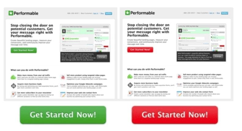
In addition to powerful words, you can also implement powerful visuals. Research from Hubspot shows that red (or orange and yellow) buttons are more effective than green ones. In their A/B testing between two buttons, red outperformed green by an outstanding 21%. So if you have a pop-in with an offer, perhaps a red button can better urge your customers to click.
Colors are not the only factors. There are many ways to make your call to action (CTA) stand out. Start with a simple and direct CTA: “Receive 20% Off”, “Give me Free Shipping”, “Get started now”, etc. You can also play with the size of the button, and its placement. Naturally, a big button in the middle of your screen will stand out more.
You can go further by adding playful designs to make your CTA pop. Some sites turn their pop-in into a Wheel of Fortune, giving customers the chance to win an incentive: free shipping, $10 off, or other similar perks. Some sites prefer to add phrases to their buttons – instead of the simple “Yes” and “No”, they display “Yes, unlock my offer”, or “No, I don’t want 20% off”. Suddenly, it’s hard to say no, right!?
Customize your offer
Another way to encourage a sense of exclusivity is through a customized offer. This usually takes the form of a referral link, special code, or something that requires the customer to be more involved, such as finding a code in their email. A customized email sent to customers who are abandoning their carts is a proven and effective way to lure them back!
For example, “Hey, you left this [product name] in your cart”, can recapture the customer’s attention. You know that they’ve already seen that product and have expressed interest in it, so why not add it to a ‘recommended for you’ email sequence if they still haven’t converted to a sale? If you also have a mobile app to accompany your online shop, why not try push notifications to remind customers what they are missing out on?
